Showing posts with label Final task. Show all posts
Monday, March 10, 2014
AS - Final task (Double spread explanation 3)
My magazine images are on the right.
I also decided to add a same color drop cap after looking at various double spread pages and seeing that almost all had a drop cap to show where to start reading from.
A small intro was also written by me to give a brief overview of the interviewer and the artist.
I also decided to add a same color drop cap after looking at various double spread pages and seeing that almost all had a drop cap to show where to start reading from.
A small intro was also written by me to give a brief overview of the interviewer and the artist.
AS - Final task (Double spread explanation 2)
I was going through various magazines online when this double spread page quickly caught my eye. After opening the image, I realised they had used a clipping mask instead of a normal page heading. We have been taught how to use clipping masks in class before and this magazine gave me the idea to use it as my heading with my artist's name.
Hence, I mixed together his pictures which I took for my magazine and used them to create a clipping mask which is different from the one image clipping mask in the 'A poet' life' heading.
I only used images here and did not add more in the double spread page unlike the original which has nother image at the bottom left.
AS - Final task (Contents explanation 3)
The page heading of my contents page is written in red font on top of a black rectangle to make it stand out more. Below it the issue number and month of it's release is also written, however it is written in a generally smaller font size.
I used a gradient as my background instead of going with a solid color because I believed it made my contents page look more alive.AS - Final task (Contents explanation 2)
After looking at various content pages, I decided I wanted my contents & pictures completely and perfectly aligned at opposite corners of the page to give it a more finished and polished look. Below are few comparisons. The ones on the left are mine and the ones on the right are from 2 different magazines Q and one another (I tried finding the name how ever was unsuccessful).
Also I have a hint of who the pictures were of by writing their names (Made up) in the color white (to stand out more) and then numbered them also in white. I made sure that no page numbers clashed and so all of them are different and carefully thought over.
I divided my contents into two parts 'Features' and 'Regulars'.
Sunday, March 9, 2014
AS - Final task (Construction 16)
I initially divided my pages into two equal sized text boxes each, linked those together and copy pasted my text. I also made a different text box at the top and wrote a small introduction of the artist and the person taking the interview( made up)
However then I looked at a local magazine and decided that it looks better to have three columns instead of two. I also added strokes to my questions to differentiate them from the answers. I also divided my 'Know him better' strip into two equal in width columns.
AS - Final task (Construction 15)
I changed my design a bit in photoshop after I had linked it to ID. Because I decided there was too much negative space above the artist's name in the black triangle.
I played around with that and got this as my final result. Since it was already linked to ID I had no difficulties with that.
I then made a black rectangle on the right side and copy pasted what I had written about my artist (from Microsoft word) in the color white.
Saturday, March 8, 2014
AS - Final task (Construction 12)
I have started to make my double spread page in Photoshop because I wanted to create a clipping mask instead of just simple font.
I first made an A3 size document. Applied a crop double the size of that to creat an A2 size document. Then made a line diagnolly, filled that with black paint and then wrote the text.After the text I made a collage of my artist's images and then applied a clipping mask.
Friday, March 7, 2014
AS - Final task (Construction 8)
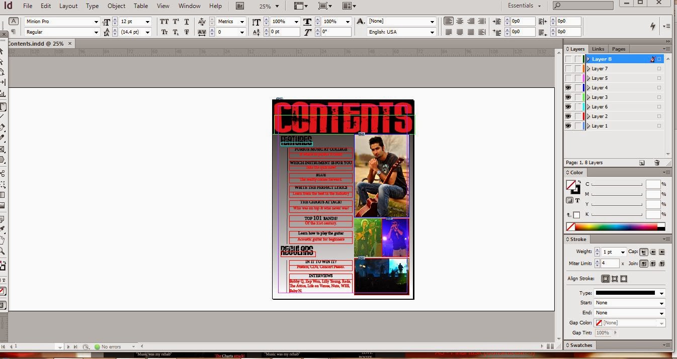
I started making my contents page in ID, a few days ago. Here are the steps I followed.
I added a rectangle on the whole page from the rectangle tool and then added a black, grey, white gradient to it.I then added a rectangle on the top and filled it with black color.
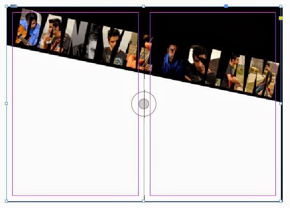
I wrote the heading contents in the font 'rock it' in the color red/maroon.
I added all of the pictures. At this point the snapping helped me a lot, since manually measuring the pictures and seeing whether they were aligned would have been a very long and monotonous task.
After the pictures I started adding the contents, again the snapping helped me a lot to align them properly.
However at this point I had difficulty deciding the font size since I didn't want it to be too large but wanted it to cover the whole page at the same time.
After writing the whole contents and dividing them into features and regulars, I described the images in one line and write their respective page numbers.
I then added 2 black 3pt lines and again snapping helped me align them with the text and with each other. And now I will be writing the numbers next to the line.


Tuesday, March 4, 2014
AS - Final task (Cover explanation 8)
I looked at various covers and then decided to stick to a set of font styles and colors instead of making it all different. Which is why I only used mostly 2 font styles and the colors white and red. I chose white and red because my image is black and white hence those colors were more visible and were standing out more.
Red is also the color of passion, lust, blood etc whereas white stands for purity. Using color psychology I decided that this combination was the best and it also suited my rock genre.
Subscribe to:
Posts (Atom)